How do you feel?

Every once in a while, I raise this poor blog back from the dead. I have a few research projects in mind, and some outstanding ones, and I’m thinking it might be time to start adding thoughts as I research various aspects of these projects. So time for some more musings!

I’ve started reading Badass: Making Users Awesome. I suspect I’ll have lots of thoughts as I read this but the first one struck me when I read the following:

It’s not how the user feels about us.

It’s about how the user feels about himself

This made me think about our library websites. I think far too often, we’re getting hung up on how the user feels about us. Are we friendly enough, are we welcoming enough? If we showcase X, they’ll think better of us, they’ll be interested in us, they’ll use/visit us.

What if we concentrate on how the user feels about himself instead? How do they feel when they interact with an academic library website (or any library site)? Overwhelmed? Lost? Frustrated? Stupid? Are we designing sites that make them feel empowered, resourceful, smart?

Unfortunately, I fear the answer to that question is too often no. Those of us who work in public services often see the frustrated user, who can’t navigate our websites or databases. Those of us who do user testing have observed users getting lost and overwhelmed as they navigate our resources, questioning their own capabilities.

Let’s switch our website goals – let’s design so that we make the user feel successful. Let’s make sure that sites are not only usable, not only user-friendly, but user empowering. After all, it’s not about us, it’s about them.

Measure twice, Cut once

You’re probably familiar with the adage “measure twice, cut once”.  Certainly sage advice for carpentry, sewing, and I might argue usability testing.

I’ve done a bit of testing now and it’s clear that multiple tests can be useful in helping get closer to a good user experience. In the last couple of years, I’ve worked on two website builds. In the first case, we did extensive testing including focus groups (I know, not usability testing but useful in its own way), open and closed card sorts, and scenario based testing. The second site was rushed in regards to testing, and while the intention was to do card sorts, we opted for a survey (I know, not usability testing) and scenario based testing.

In both cases, the results of the first tests (card sorts, surveys) gave us some good ideas and seemed to confirm our suspicions. We thought we were close to where we needed to go with our design/terminology/architecture. However, it wasn’t until the scenario based testing that we truly saw if we were on the right track.  For example, terminology that works well in a card sort or survey, can prove to be more problematic when put into the actual context of a website.

One might argue that you could jump the first step and go right to scenario based testing. There is little better than actually watching your users try to find things on your website. But I think there is value to testing suspicions before putting it in the proper context on a website. We might have missed an issue with terminology if we hadn’t done a card sort and only offered one option on a website scenario based test.

Rule out obvious problems with a small test, such as terminology through a card sort, and confirm these results and explore more intricate issues with a deeper, scenario based test.

Test twice, change once.


UX and Cultural Changes

I’ve presented and written about creating a culture of usability and the challenges of this process. I came here with big ideas and 4 years later, I’m starting to see some real changes and I’d like to give a shout out to my awesome colleagues here as they start to embrace the idea of the user experience in what we do.

We’ve faced a number of major systems changes in the last couple of years but this means we’ve also had a chance to reevaluate what we do, how we do it, and how it affects our users. I’m having more conversations about user experience and they aren’t all initiated by me. As we introduce new products or services, folks are open to user testing to ensure a good user experience. My colleagues may be tired of hearing my say “but how does that affect our users; how can we make it better” but it’s becoming a regular part of the conversation.

Four years may seem like a long time to see changes, but cultural changes take time. And I’m certainly not saying that folks I work with didn’t think about our users before, but I do think that what I’m seeing is a shift in our culture, something that’s becoming a common value in my organization and I think that’s exciting.

UXLibs Skills & Tools

It’s often disappointing to attend an exciting or inspiring conference and then come back to the reality of the workplace. It can be hard to maintain the energy, especially when you return to a full plate of work that can slow down your progress or you run into impediments or barriers when trying to implement new projects or ideas. I’m still excited by the big ideas and skills from #uxlibs and my to-do list is long but it’s finally time to write a little bit about the workshops and hands-on activities.

I got to attend two workshops, though there were 2 other groups in simultaneous sessions. I have to say, that’s one of my few complaints about the conference. I heard a little about the workshops from my other team members (there were 3 or 4 members in each session, ensuring that the group as a whole had an awesome set of new skills) but unfortunately, there was little time to fully go over what each group has learned. What I did hear made me wish I could have attended all of the sessions.

My first session looked at mapping and interviewing with Andrew Asher. I was slightly surprised that I enjoyed the mapping portion as much as I did. We looked at spatial and directional mapping. We all drew maps of our own libraries and it was quite revealing about how we think of both our spaces and services. Often the first things we map our the most important or most used spaces/services. Mapping can also be applied to the research process and I’m quite interested in using it more to determine how our digital spaces are used (I think I saw on twitter that ACRL had some discussion on this in the cognitive mapping session (#cogmap, #acrl2015), I think by Donna Lanclos and Andrew Asher in fact). I can’t wait to try mapping with some of our students.

One of the great things about the conference is that once we learned some new skills and tools, we got a chance to try them out. Conference organizers had arranged visits at the libraries in the areas and lined up students for us to work with. This was a really important step as we got to cement the skills and ideas we had just learned and it gave us lots of data to work with later. Our group (go team Red Bulls!) used a variety of techniques that we had learned in our first workshops – we used observation techniques, touchstone tours, interviews and research mapping. We only had two hours, which flew by, and we left inspired, overwhelmed and a little uncertain of what we would do next.

Our second workshop concentrated on what to do with the data once we got it – how to identify problems or areas to pursue. I got to attend a great session with Matthew Reidsma and Matt Borg on affinity mapping and empathy mapping. This is where post-it notes are key. We used the conference hashtag as our data source and half of the group did each type of mapping. Affinity mapping is probably what most folks are familiar with – it basically groups likes things together in order to find major themes and then pulling our pain points from it. Empathy mapping was new to me and I’d like to try it out. There are four quadrants – think, say, feel, and do – and you put each data point in its quadrant and then pull out issues and pain points from there. I like that it’s looking at what’s driving the user rather than just what they did.

Following this workshop, we again got time to apply the new techniques. Our group wasn’t sure if we’d gotten enough data in only 2 hours, 3 students, and a few poor souls we bugged during our visit. Turns out that it was quite the opposite case. Applying the above techniques, we found we almost had too much data and lots of areas that we could see libraries could improve upon.

Our final activity was to find one area to improve upon, suggest a solution, and pitch the solution in 15 minutes. Phew. That was both fun, inspiring and a lot of work. It was difficult to figure out what to suggest in such a short time, let alone come up with a presentation to convince the judges it was a good idea. Despite the intensity of the situation, all of the groups came up with amazing ideas and pitched them well. I was surprised by how well we seemed to work as a group and I think that we got to connect via Basecamp prior to the conference may have helped us work better when we got to the nitty gritty portions of the work. The only issue with the pitch was that I didn’t get to see them all. Luckily, we may still get to hear more about the work of our colleagues.

All in all, the workshops were both fun and informative. The time to apply the new techniques allowed us to leave with actual practiced skills. Our team had a variety of skills that we either practiced or learned a little more about when we talked with our teammates, watched them practiced it or even examined our data. I left the conference with new skills and a list of techniques I need to go learn more about.

There have been lots of posts on the keynotes, including those by Shelly Gullikson and Ned Potter, and you can see Matthew Reidsma’s slides but if I find the time, I’ll try to jot down my thoughts on the keynotes. Update: Donna blogged about her keynote too.

A New UXLib Community

If you’ve been following me on twitter, you’ll know that I can’t stop talking about my experience at the recent User Experience in Libraries conference workshop that was held in Cambridge, UK. There are multiple blog posts worth of content/ideas/reflections and I’m still synthesizing the whole conference but this will be my start.

While I’m still mulling all the things I’ve learned over, I thought I’d start with lists.

A few things I’ve learned from the conference:

1. Ethnography requires an open mind – observation comes first and questions come from the observations. This was a bit of a struggle for me, as most of my work has been around usability, which requires a question first, then the observations (and likely more questions).

2. Post-it notes are essential. They are my new best friend. Libraries should be stocks in post-it notes. There are so many ways to use them to help identify issues, ideas and more. I learned awesome new techniques and will be putting them to use in the near future. (More on this in another post on skills from the conference)

3. Mapping is awesome. I went to a workshop on mapping and now I can’t wait to apply the methods we learned. (More on this in another post on skills from the conference)

A short list of the awesome things from this conference:

1. A new community of library folk who are excited by UX and intend to go improve their libraries with the users’ needs in mind. This is really great to see. Before the conference, there were definitely library folk who were interested in UX and were doing awesome things but I think this has been the first time that we’ve had a focused community come together. I feel like this is a group that will continue working together, from the small groups we worked in, to partnering with others who attended the conference.

What surprised me was how diverse it the group was – both in location and in job description. I expected a lot of web and techy folk but there were so many public services people. It’s great to see UX being applied to the whole library. I’d love to see more senior administrators attend this type of conference, to help remove barriers when doing this type of work.

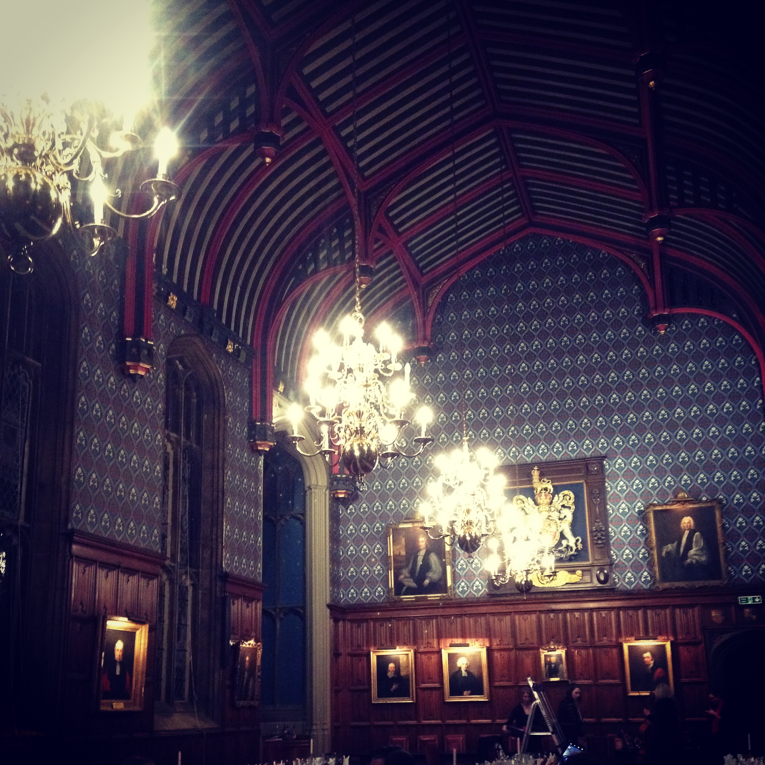
2. Location, location, location. I fell in love with Cambridge. Most of the spaces we dined and networked in were simply gorgeous.

IMG_7459

Update: I forgot to add number 3, so here it is.

3. Keynotes are people too. It was great to see keynotes acting as mentors, workshop leaders and judges. They weren’t just a sage on the stage. We got time to work with and talk with them, which is an invaluable experience.

A short list of things for other conferences to consider:

1. Small can be awesome. The conference only had somewhere between 100 – 120 attendees. This meant that it was easy to meet lots of folks and have real conversations.

2. We’re not afraid to work. UXLibs was intense. I’ve never been so exhausted after a conference, nor worked so hard. I didn’t even get a chance to look at my work email (unheard of!). Yet, even with all the work, we were all invested, focused and excited.

3. A mix of keynote and practical is awesome. The keynotes were amazing at the conference. They didn’t just know what they were talking about but they did it and the presented it well. The workshops left me with skills I feel ready to apply in my library. I left with both big ideas and new skills.

4. Community is key. One of the great things about the conference was that all of the teams had a space in Basecamp to work and were encouraged to participate in this space before the conference started. This helped groups do the introductions and group building part before arriving at the conference. I felt like I knew folks before I got there and it made it easier to chat and get right to work.

More on the workshops will be coming soon, when I find the time to go back through all my notes.

The conference committee deserves huge props for putting on an innovative and practical conference. They all deserve rest, but I can’t wait for round 2 so I can build on these skills!


we don’t need no stinking website

I’ve been doing a lot of usability testing as we redesign the library website. It has been both enlightening and unsurprising at the same time. It’s confirming many of my beliefs and biases when it comes to the library website.

Most recently, we did a little guerrilla testing, nabbing folks to take a look at our prototype and see what they thought and how they might use it. Generally, we got some good feedback. Most liked the way we were going with the designing, using terms like user friendly, easier to use, organized, and modern. Yay!

There’s been lots of interesting feedback from this testing that I’m still sifting through. But what surprised me was how often, when asked what they would do on the library website and presented it to them, they simply said they wouldn’t use the library website. They would ask friends, google, ask at the circulation desk. Now, this isn’t terribly surprising – we know that our users often come to the library website as a last resort. There are lots of other ways for our users to find what they need. What surprised me was that they wouldn’t even look at what we were showing them to see what they could do. It simply wasn’t their behaviour, so they didn’t want to bother looking.

So, what does this mean? I’m still working that out. Do we need our users to come to the library website? Certainly not for everything. When they do, it should be user friendly. But I’m still trying to figure out what to do with the answer I wouldn’t use the library website. Definitely more testing in store!

The website is everything

I recently conducted a survey about my library’s website. We’re doing a redesign and wanted feedback on how our website it used, and more importantly (to me anyway) what our users felt was working and what needed improvement. We sent it out to the entire university community and were thrilled to get about 2000 responses (about a 10% response rate). I’m excited that our users have some strong feelings about library resources and want to share them.

We’re still going through the survey results and conducting analysis. It’s probably a good sign that, so far, there has been nothing terribly surprising. Things we thought were pain points are in fact causing problems for our users. What’s become even more apparent to me is that everything that is online/linked to from the library website is considered the website. I’d guess that about 1/3 to 1/2 of the comments so far have actually been about problems that are not the website but the OPAC, the discovery layer, our databases or the link resolver.

As librarians, we know the myriad of systems that our libraries use. Our users do not. And ideally it shouldn’t matter to them – they just want to easily find their resources, regardless of what it is. A large problem is that our systems don’t always play well with each other. The navigation changes between them. The look and feel may change between them. It alters, and usually reduces, the overall user experience as our users move between systems that we have varying degrees of control over.

So when we ask about the library website, we get feedback about all of our online resources. Is this bad? Of course not! In one fell swoop, we’ve gotten feedback on all sorts of resources we absolutely need more user feedback on. I expect this one survey will keep me busy for quite some time.

For me, the bigger question is how to get all of these online resources to work better, integrate better, and create a better user experience?   I also wonder if our goal of consistent branding across resources causes confusion and reinforces the idea that it is all the library website or helps provide a seamless experience. In the end, we need to make the experience easy for our users – and the survey has certainly shown me that we can do lots to improve it at my institution.